Philadelphia-New York-Paris
I have very few obligations per se, and I count myself very lucky for that. I do, however, have to make trans-Atlantic trips a few times a year. I left Paris the day after a massive strike of the major unions here in France, protesting the new labor laws proposed by the right-wing Socialist government here (it is ironic really that the government of Manuel Valls under a Socialist president has managed to become more conservative even than that of François Fillon under Sarkozy's proto-"Republican" presidency). The new proposals allow businesses to fire workers with impunity and would align the French social fabric to resemble more closely that of its German and Anglo-American counterparts. I came back to Paris the same morning as the terrorist attacks in Brussels. My flight arrived ahead of time and I had left the airport before the events in Brussels took place.
In between the two events, I spent ten days between Philadelphia and New York City. Exhibition hightlights in Philadelphia include a survey of Picasso's work before and after the First World War at the Barnes Foundation. The small exhibition highlights the work that show his transition from Cubism to a neo-Classicism, or would one call this a pastiche of classicism (evident in the props and costumes for the ballet "Parade). At the Philadelphia Museum of Art, one has a survey of "International Pop." The many different nations that took up the Pop formula (if a formula is to be followed, perhaps the Pop Art formula is the easiest to emulate, its roots so massively invasive globally), only confirms that a "look" and a "style' does not great art make, that is if one still believes that quality is possible. It was a pleasure to see a beautiful painting of pastries by Wayne Thiebaud, but all in all, one has a sense that the Pop Art formula is one that shows its limitations very quickly.
In New York, the Frick Collection has a fascinating exhibition of the portraits of Anthony Van Dyck. Our modern sensibilities fall more easily in love with his oil sketches, the bravura of his virtuosity is dizzying and reminds one of the absolute prodigy that Van Dyck was, Painting's Mendelssohn, or even Mozart. His formal portraits, grouped together on the ground floor, are victims of their perfect poise and if one is looking for that very modern need for psychological dévoilement, one will be disappointed, as the portraits, even that sumptuous masterpiece of Baroque portraiture, his portrait of Cardinal Guido Bengivoglio, painted at the age of 24 years, shows the artist at a courteous distance, giving air and nobility to his gracious sitter:
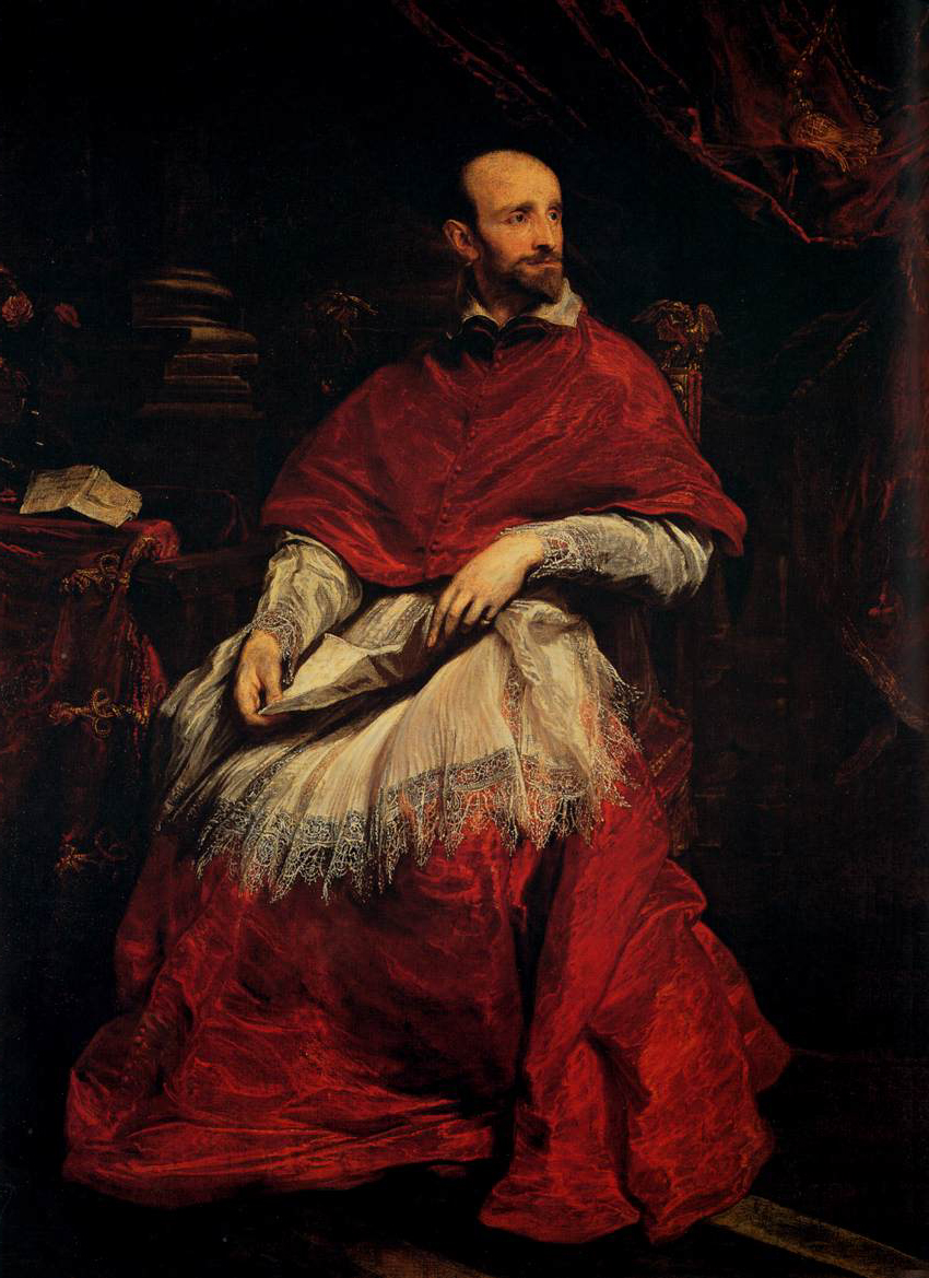
Van Dyck is not Rembrandt, and it would be comparing apples and oranges to put them side by side. As Guston said, Van Dyck is all about the paint and Rembrandt is all about this living thing evoked by his alchemy (one would say the difference between them is the separation of virtuosity from black magic).
At the Whitney, apart from discovering the new building and its surroundings, I enjoyed seeing some of the paintings from its permanent collection. If it is interesting to see the works of painters such as Paul Cadmus and Thomas Hart Benton exhibited on the fifth floor of the museum, the illustrative diagramatic nature of their paintings appear flat and anecdotal next to a ravishing de Kooning, in all its blazing yellow glory.

There is nothing wrong with widening the scope of a museum's display, if not to find the golden oldies truly golden.
Things fared less well on the lower floors of the new Renzo Piano space. The third floor exhibition space swallowed up a 3 day-long exhibition/performance by, I suppose, a current It-Girl -- Lucy Dodd. Her paintings and their installation could not withstand the two panoramic views on either end of the space and one could not in anyway look at her "sails' of canvas, stained and worked in earthy organic colors, in any satisfactory way. Their prop-like presence, held up by a hazardous scaffolding of cut two by fours and sand bags, became just that -- props for visitors to walk by. In fact, they became a non-entity, like musack at a high-art Walmart, as everyone was intent on just sitting on the sofas and looking the other way to avoid their non-presence, perhaps like me, feeling guilty for not trying harder to look at them. The question one wonders though is that perhaps there was nothing to look at -- you be the judge:
There is a certain lyricism to them I suppose, and the use of organic material "found during her voyages" may be a sort of innovation, but one wonders if that is really the case all the same.
The Chelsea gallery scene has changed from a thriving buzzy fine art gluttony when I still lived in New York (I left in 2008), to what amounts to a heavy attrition of the number of galleries to the survival of the most affluent. It seemed that only the big names could still afford to stay put. I was quite fed-up with the vitrines à la Damien Hirst of bound horse forms at Hauser and Wirth. How many glass boxes of animal parts can collectors collect, one wonders? I guess if one can keep recycling styles, one can recycle vitrines and fill them with animal parts, more or less artistically displayed with more or less historical precedents, justifying it with some sort of commentary based on old images of dead horses on battle fields in World War I. When will we put one of those dissected cadavers from the "Bodies" exhibitions into a vitrine and give it some sort of artistic/sociological/hisorical significance by exhibiting it in a well-appointed space?
The most memorable show in Chelsea for me was the humorous paintings of Elena Sisto at Lori Bookstein -- wacky comics of compressed genre scenes, witty and beautifully composed. One forgets that she has been at this for a long time and there are scores of younger painters who fall into this same vein of blonde colors and flattened imagery (Matt Bollinger, Dana Schutz, Jules de Balincourt, come to mind for example).
There was a group show at Matthew Marks main space on 22nd Street, and one of Terry Winter's Tesselation Figures can be found in the back of the gallery -- a painting pleasure, the sumptuous paint is delightful and Winters really is on to something wonderful with this series.
Speaking of Mathew Marks, at his 526 W 22nd Street annexe, there is until April 30 a lovely exhibition of photographs by Luigi Ghirri called "The Impossible Landscape." Given the exhibition's title, hovering between romanticism and existentialist triteness, I was pleasantly surprised to find small photographic haikus that were neither trite nor visually stupid. These pieces were photographed in the 1970's and the pre-digital age prints gives the work a touch of nostalgia but the astuteness of the photographer's eye cancels out any blatant sentimentality nor triteness. In fact, the photographs are everything the photographer searched to capture: "I have viewed these places with a gaze full of affection and love, in an attempt to perceive a simple and astonished feeling of belonging" (taken from the exhibition's press release). The photographs are full of surprises and each is beautifully composed and captured.
I only had time to visit two shows in the Lower East Side. At Steven Harvey Fine Art Projects, the drawings of Angela Dufresne are full of vivacious vibrancy and her video mash-ups of her covers of pop songs show the same humor and vivaciousness. Dufresne is a fabulous painter and a fantastic draughtswoman, and her videos are fun, never pretentious, and full of beautiful moments.

At Zürcher on Bleeker Street, Regina Bogat's pieces show a hermetic restraint that present a very real alternative to Frank Stella's Maximalist narrative. Only recently "re-discovered," her use of different materials in her paintings is decades old -- starting in the 1970's. There is a strictness to her work, a devotion to the Minimalist grid. Their formal restraint is coupled with a willingness to use overpowering colors -- violets, cobalt greens, reds, cadmium orange -- and if they do not convey exactly the desolation and torment that she says is the inspiration of her work on display, they invite contemplation and looking.
In between the two events, I spent ten days between Philadelphia and New York City. Exhibition hightlights in Philadelphia include a survey of Picasso's work before and after the First World War at the Barnes Foundation. The small exhibition highlights the work that show his transition from Cubism to a neo-Classicism, or would one call this a pastiche of classicism (evident in the props and costumes for the ballet "Parade). At the Philadelphia Museum of Art, one has a survey of "International Pop." The many different nations that took up the Pop formula (if a formula is to be followed, perhaps the Pop Art formula is the easiest to emulate, its roots so massively invasive globally), only confirms that a "look" and a "style' does not great art make, that is if one still believes that quality is possible. It was a pleasure to see a beautiful painting of pastries by Wayne Thiebaud, but all in all, one has a sense that the Pop Art formula is one that shows its limitations very quickly.
In New York, the Frick Collection has a fascinating exhibition of the portraits of Anthony Van Dyck. Our modern sensibilities fall more easily in love with his oil sketches, the bravura of his virtuosity is dizzying and reminds one of the absolute prodigy that Van Dyck was, Painting's Mendelssohn, or even Mozart. His formal portraits, grouped together on the ground floor, are victims of their perfect poise and if one is looking for that very modern need for psychological dévoilement, one will be disappointed, as the portraits, even that sumptuous masterpiece of Baroque portraiture, his portrait of Cardinal Guido Bengivoglio, painted at the age of 24 years, shows the artist at a courteous distance, giving air and nobility to his gracious sitter:
Anthony Van Dyck, Cardinal Guido Bengivoglio, 1623, Oil on Canvas, 195 x 147 cm
Van Dyck is not Rembrandt, and it would be comparing apples and oranges to put them side by side. As Guston said, Van Dyck is all about the paint and Rembrandt is all about this living thing evoked by his alchemy (one would say the difference between them is the separation of virtuosity from black magic).
At the Whitney, apart from discovering the new building and its surroundings, I enjoyed seeing some of the paintings from its permanent collection. If it is interesting to see the works of painters such as Paul Cadmus and Thomas Hart Benton exhibited on the fifth floor of the museum, the illustrative diagramatic nature of their paintings appear flat and anecdotal next to a ravishing de Kooning, in all its blazing yellow glory.

Willem de Kooning, "Door to the River," 1960, Oil on Canvas, 203.5 x 178.1 cm
There is nothing wrong with widening the scope of a museum's display, if not to find the golden oldies truly golden.
Things fared less well on the lower floors of the new Renzo Piano space. The third floor exhibition space swallowed up a 3 day-long exhibition/performance by, I suppose, a current It-Girl -- Lucy Dodd. Her paintings and their installation could not withstand the two panoramic views on either end of the space and one could not in anyway look at her "sails' of canvas, stained and worked in earthy organic colors, in any satisfactory way. Their prop-like presence, held up by a hazardous scaffolding of cut two by fours and sand bags, became just that -- props for visitors to walk by. In fact, they became a non-entity, like musack at a high-art Walmart, as everyone was intent on just sitting on the sofas and looking the other way to avoid their non-presence, perhaps like me, feeling guilty for not trying harder to look at them. The question one wonders though is that perhaps there was nothing to look at -- you be the judge:
There is a certain lyricism to them I suppose, and the use of organic material "found during her voyages" may be a sort of innovation, but one wonders if that is really the case all the same.
The Chelsea gallery scene has changed from a thriving buzzy fine art gluttony when I still lived in New York (I left in 2008), to what amounts to a heavy attrition of the number of galleries to the survival of the most affluent. It seemed that only the big names could still afford to stay put. I was quite fed-up with the vitrines à la Damien Hirst of bound horse forms at Hauser and Wirth. How many glass boxes of animal parts can collectors collect, one wonders? I guess if one can keep recycling styles, one can recycle vitrines and fill them with animal parts, more or less artistically displayed with more or less historical precedents, justifying it with some sort of commentary based on old images of dead horses on battle fields in World War I. When will we put one of those dissected cadavers from the "Bodies" exhibitions into a vitrine and give it some sort of artistic/sociological/hisorical significance by exhibiting it in a well-appointed space?
The most memorable show in Chelsea for me was the humorous paintings of Elena Sisto at Lori Bookstein -- wacky comics of compressed genre scenes, witty and beautifully composed. One forgets that she has been at this for a long time and there are scores of younger painters who fall into this same vein of blonde colors and flattened imagery (Matt Bollinger, Dana Schutz, Jules de Balincourt, come to mind for example).
There was a group show at Matthew Marks main space on 22nd Street, and one of Terry Winter's Tesselation Figures can be found in the back of the gallery -- a painting pleasure, the sumptuous paint is delightful and Winters really is on to something wonderful with this series.
Speaking of Mathew Marks, at his 526 W 22nd Street annexe, there is until April 30 a lovely exhibition of photographs by Luigi Ghirri called "The Impossible Landscape." Given the exhibition's title, hovering between romanticism and existentialist triteness, I was pleasantly surprised to find small photographic haikus that were neither trite nor visually stupid. These pieces were photographed in the 1970's and the pre-digital age prints gives the work a touch of nostalgia but the astuteness of the photographer's eye cancels out any blatant sentimentality nor triteness. In fact, the photographs are everything the photographer searched to capture: "I have viewed these places with a gaze full of affection and love, in an attempt to perceive a simple and astonished feeling of belonging" (taken from the exhibition's press release). The photographs are full of surprises and each is beautifully composed and captured.
I only had time to visit two shows in the Lower East Side. At Steven Harvey Fine Art Projects, the drawings of Angela Dufresne are full of vivacious vibrancy and her video mash-ups of her covers of pop songs show the same humor and vivaciousness. Dufresne is a fabulous painter and a fantastic draughtswoman, and her videos are fun, never pretentious, and full of beautiful moments.

Angela Dufresne, The Real Allegory of my Artistic and Moral Life, 2014, Oil on Canvas, 7 x 11 feet
At Zürcher on Bleeker Street, Regina Bogat's pieces show a hermetic restraint that present a very real alternative to Frank Stella's Maximalist narrative. Only recently "re-discovered," her use of different materials in her paintings is decades old -- starting in the 1970's. There is a strictness to her work, a devotion to the Minimalist grid. Their formal restraint is coupled with a willingness to use overpowering colors -- violets, cobalt greens, reds, cadmium orange -- and if they do not convey exactly the desolation and torment that she says is the inspiration of her work on display, they invite contemplation and looking.


Comments
Post a Comment